We decided it was important before continuing with our campaign to look at existing hand advertisements, not only for inspiration but also to make sure we weren't using an idea which had already been done. Through this time I found some amazing pieces connected to hands that I was really impressed with and took on board as inspiration. The first one was the Guinness Hand Advert:
It is a similar idea to what we have done for one of our Youtube/Viral video ideas and thought it was interesting and useful to us. It has a similar home made feel to what we wanted to create, using a plain background (although we intend to add a back image) and then the use of hands as the main focus. Just like our idea, we are not advertising hands which we felt was important.. I really like the repetition used and the fact that you don't know what its for until the end, but once you do you wont forget. The insight into this is really significant to the product.
I also found a St Patricks edition of this:
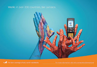
I then came across poster image advertising for company AT&A, the full set for the campaign can be seen here:
http://www.flickr.com/photos/shareatt/sets/72157622368636074/
Some of my favourites are below:
I was so impressed when I found these, they are so beautiful and innovative and clever, I love the way they have incorporated the fact that hands are used to make calls send texts etc but then they have made them relevant to the 'truth' or the company which is that the network is the best in many different countries for signal etc. I cant even describe how impressed I am with this campaign, I absolutely love it! It has made me think about other ways of how we can include hands into our campaign rather than using just bare skin, we could think about layering images on top of it or incorporating images onto the hands...?


No comments:
Post a Comment